La Dura Brand
Client: La Dura gear. This project was done as part of my freelance work.
La Dura Dura means 'The Hard Hard', and is the name of a famous climb that got its name for being regarded as one of the hardest climbs in the world at the time. This was the inspiration for the name La Dura, a small climbing gear company focusing on creating sustainable outdoor gear. The brief was to create a logo for this emerging startup.
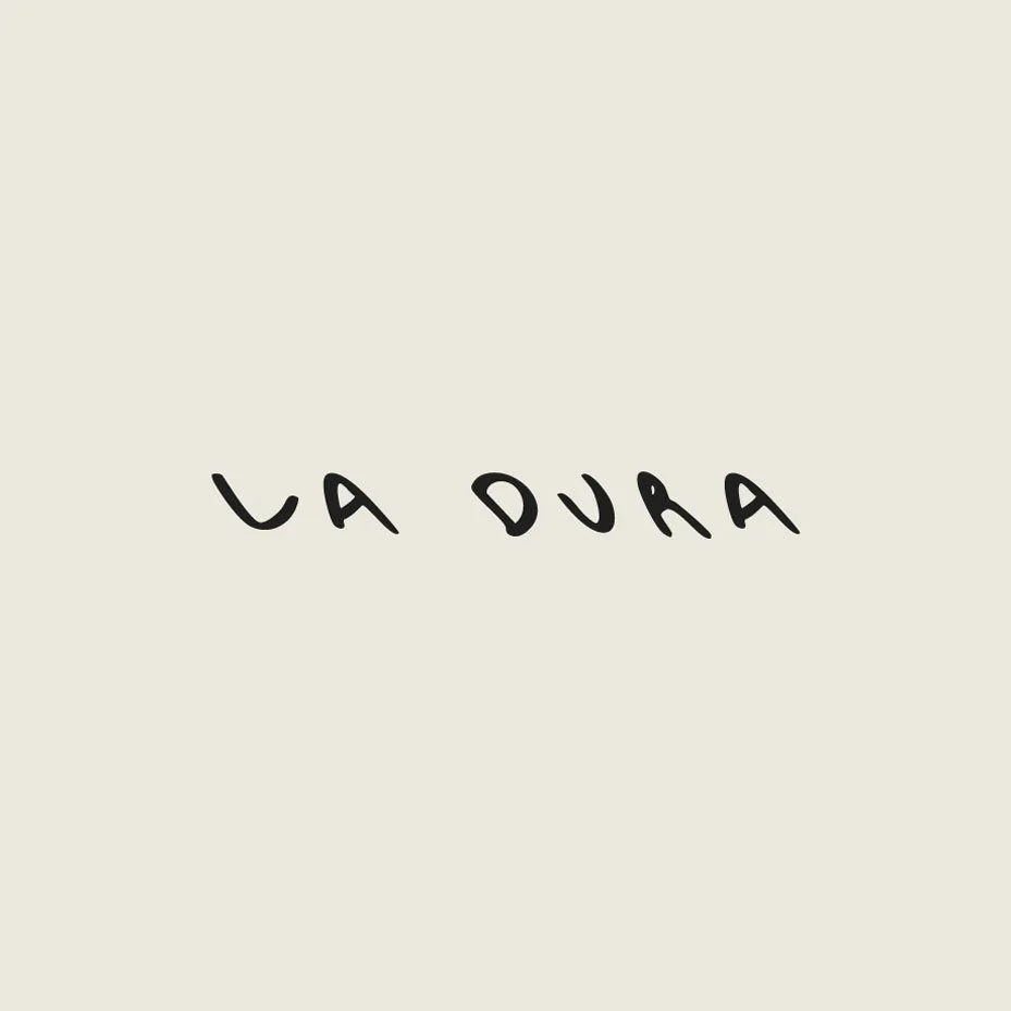
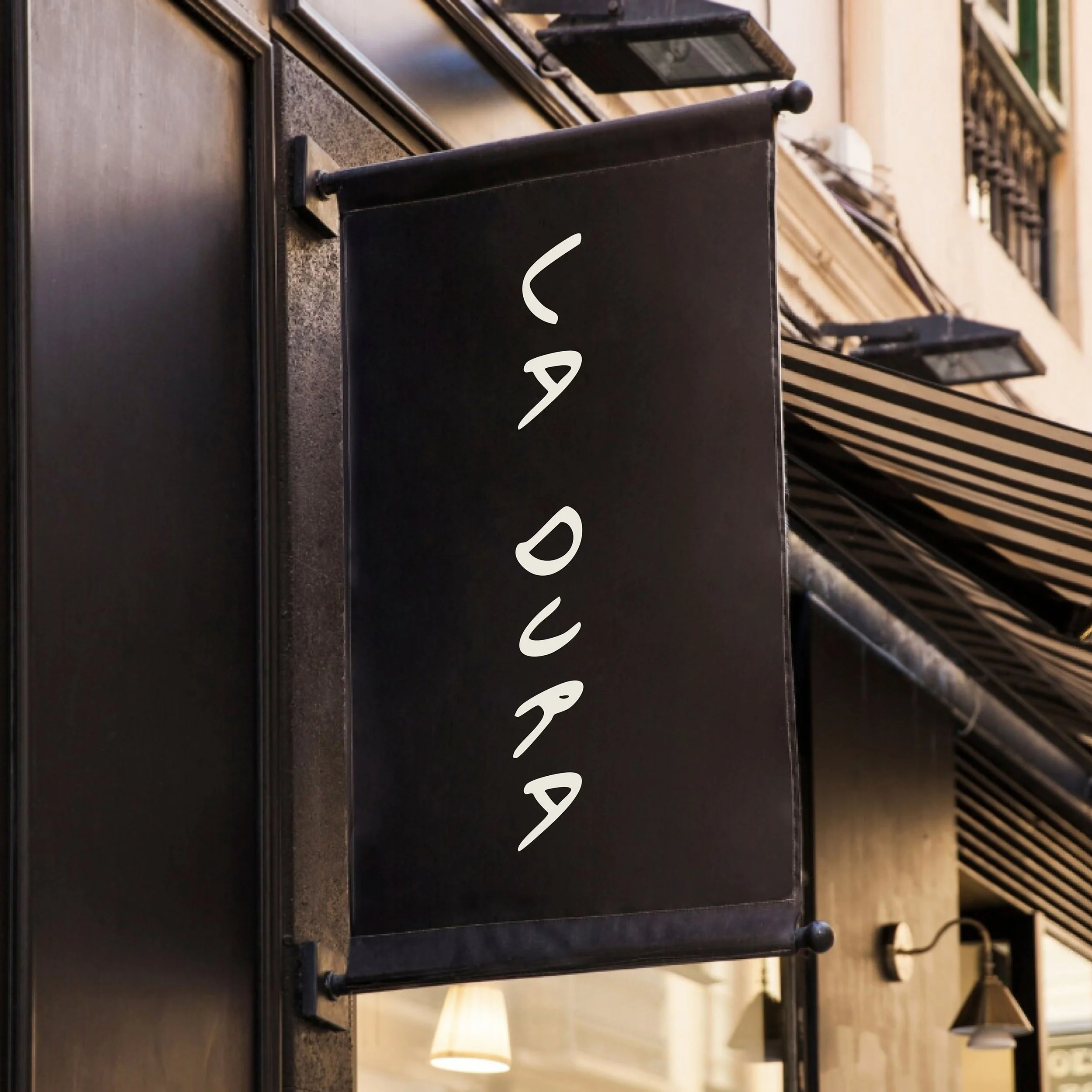
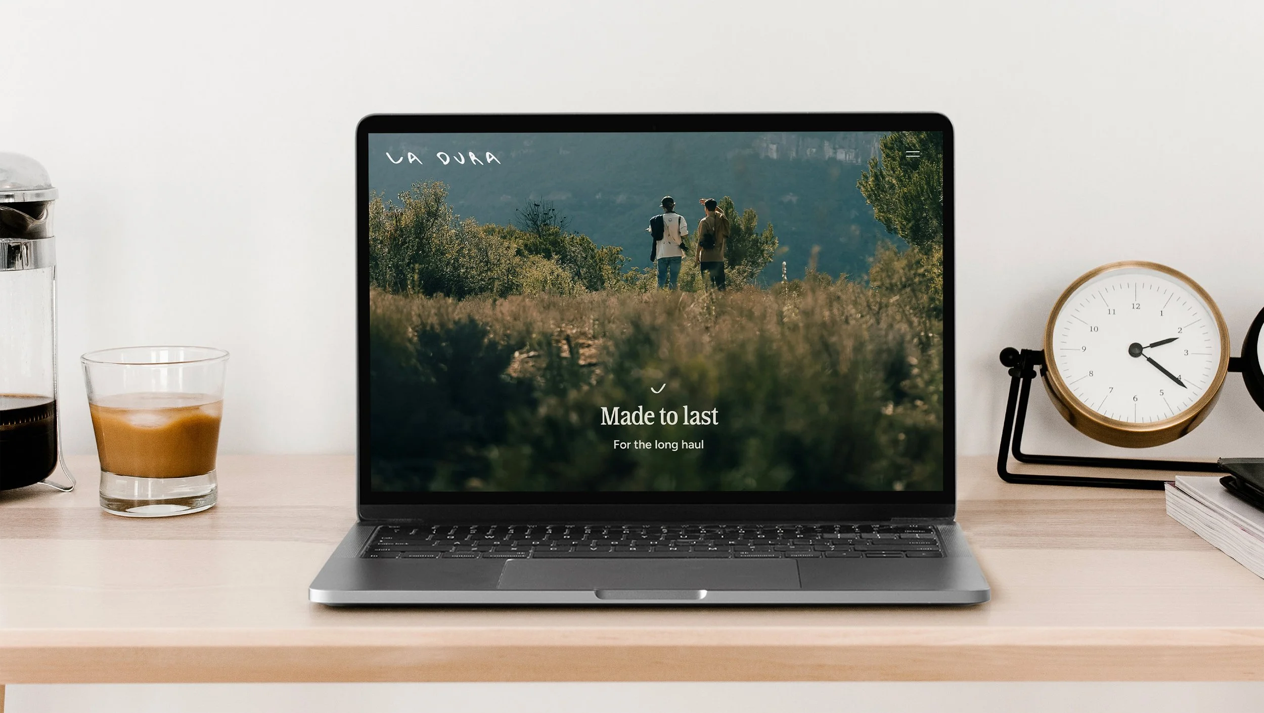
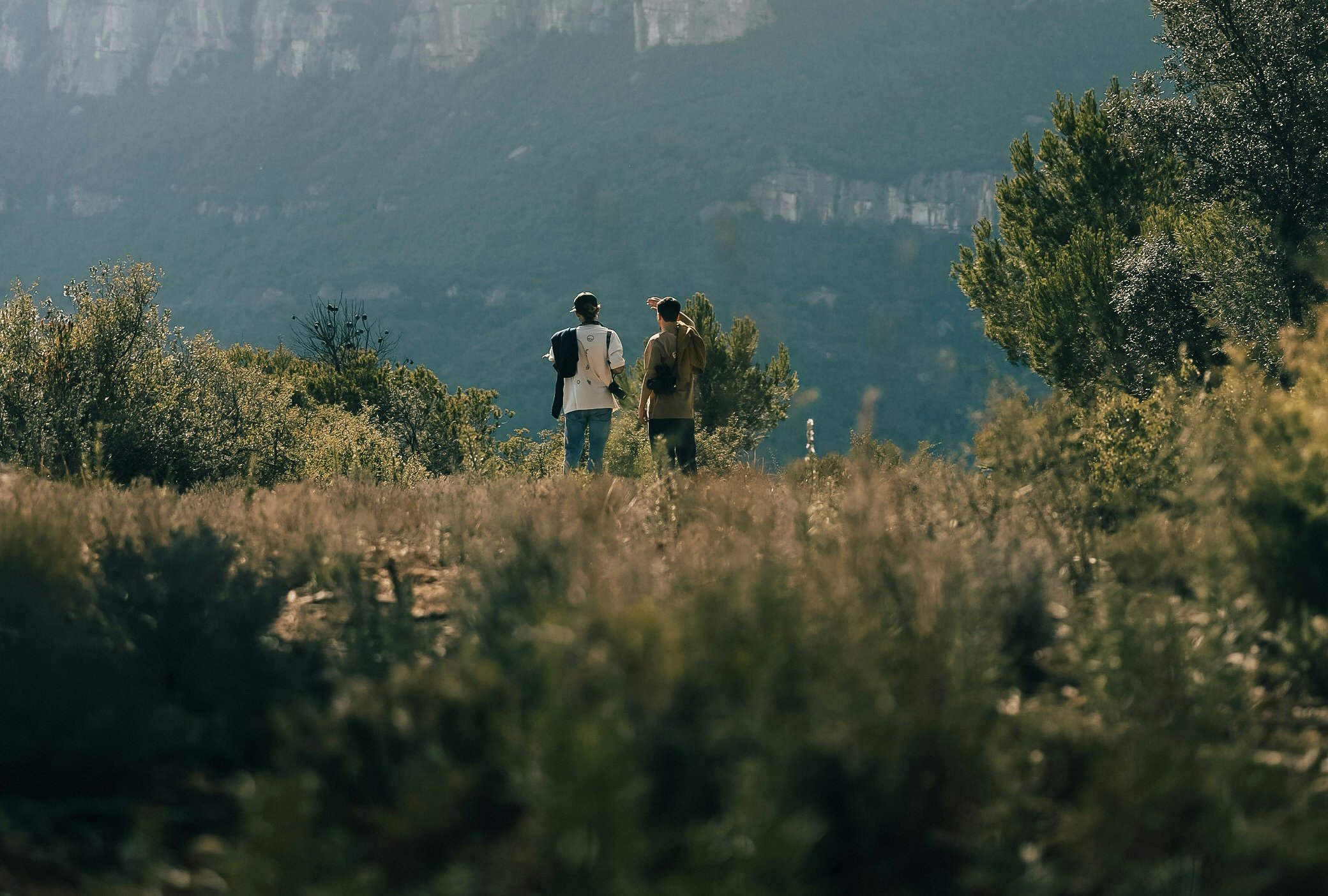
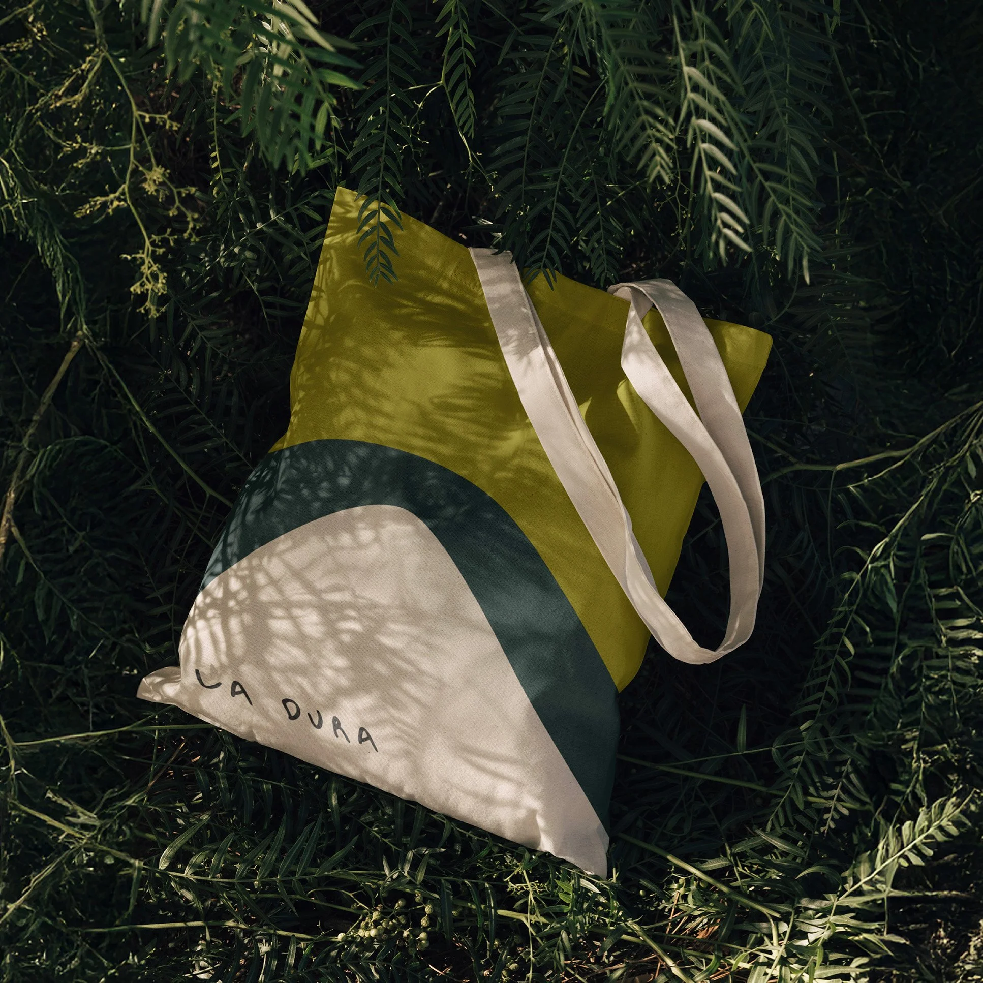
La Dura is all about creating gear that is sustainable and therefore long lasting, for hard conditions. Durable. Made to last was born from this and describes the brand ethos. Earthy, humane and connected were some of the key characteristics, which the brand was built on. The hand drawn logo was created to reflect this persona, using organic, natural shapes. The slanted angle plays with the idea of windy conditions.
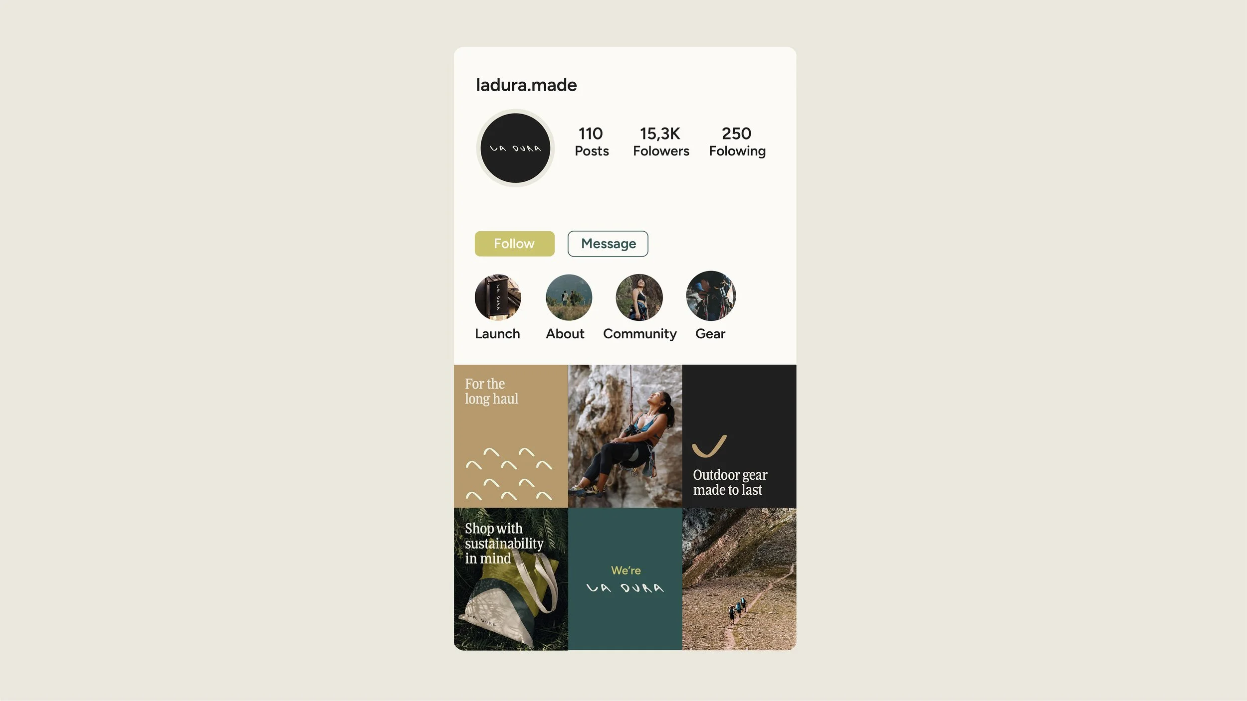
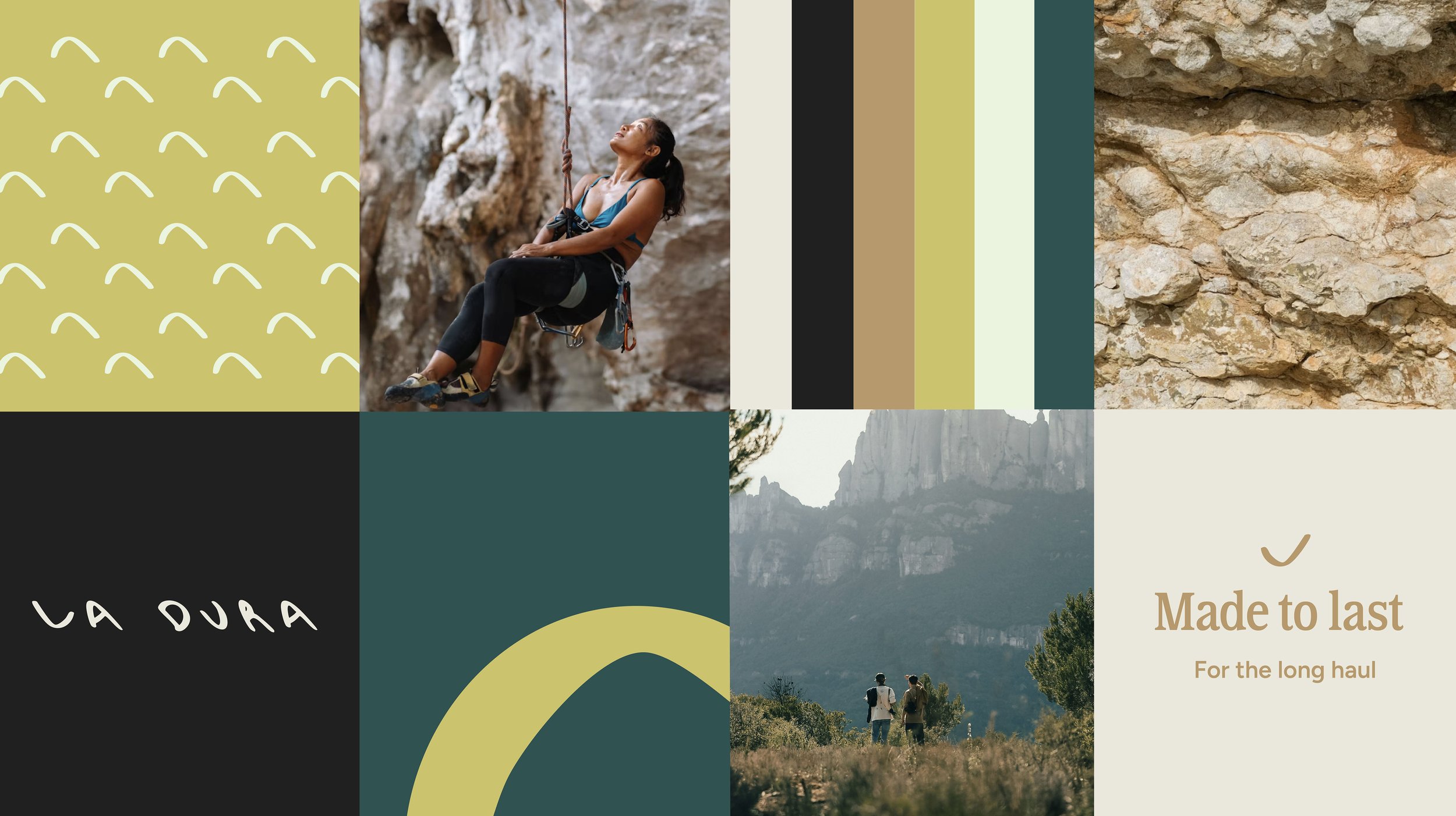
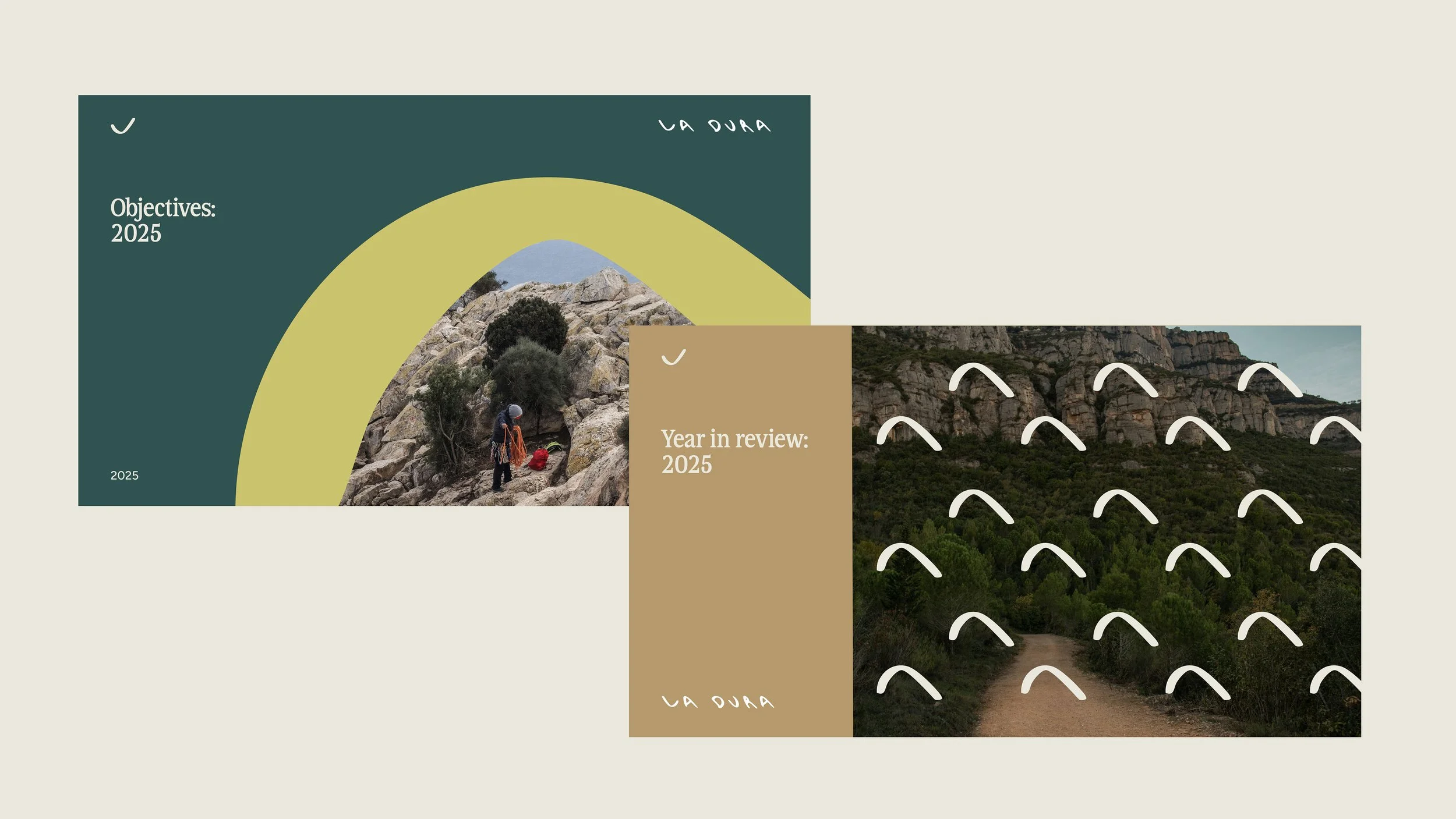
The L shape from the logo was used to create a graphic device. when flipped horizontally, it creates a mountain shape which is used a shape and a pattern throughout the La Dura branding. It is flipped vertically to create the La Dura tick motif, which symbolises the company’s focus on product quality, connecting back to the ethos Made to last.